Peer comparison
Peer comparison is a feature available in Performance overview that shows how your spend performance relative to the market compares to that of your industry or volume peers across your largest corridors.
Peer comparison only works if we have access to your latest rates and volumes. Be sure to provide your data regularly so you can compare yourself to your industry peers.
Compare to industry peers
To see how your performance compares to that of your industry peers, go to the Industry peers tab and then select your industry group (or an individual industry within the group):
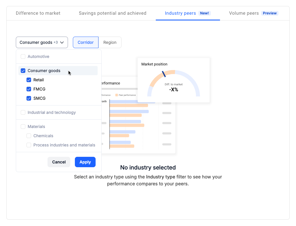
You can only select industries within one group at a time. While the Peer comparison filter is active, other market metrics filters aside from contract length will not be available.
Once you click Apply, the page will be updated with additional information on your performance relative to your peers in the selected industry:
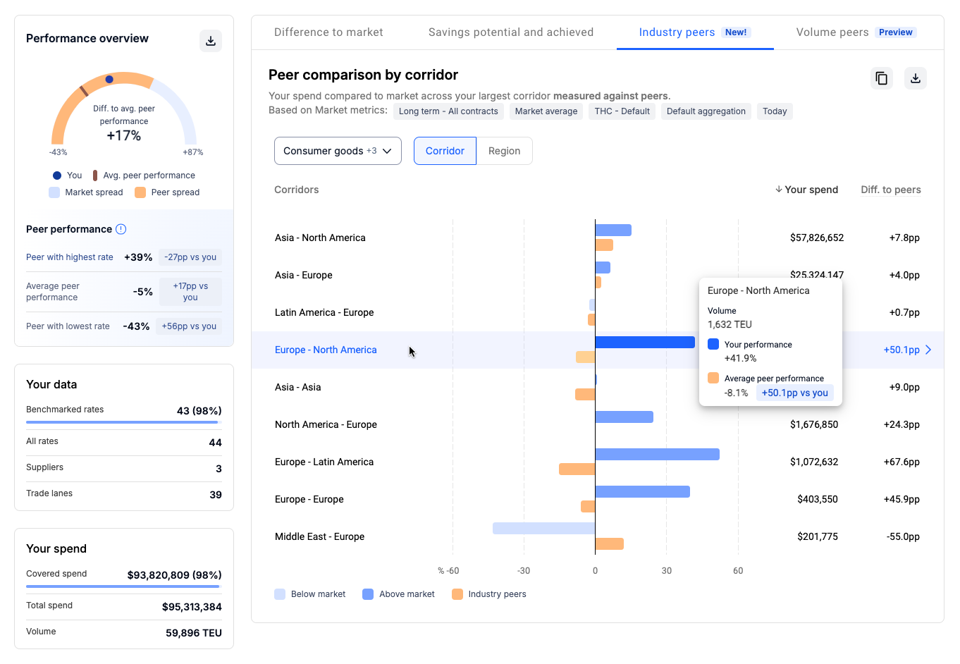
The gauge under Your performance will show your current position within the selected industry as well as the broader market. The blue spread indicates the overall market spread between the company with the lowest and highest rates and shows your position within the market, across all corridors and companies. The orange spread shows industry-wide performance across all trade lanes regardless of your contracted corridors. This ensures a consistent industry benchmark.
The Peer performance section provides a general summary of how your industry peers are doing, and how their numbers compare to yours across the top ten corridors in your portfolio:
- Average peer performance — how all your peers within the selected industry are doing relative to market average
- Leader's position — the position of your industry peer with the lowest spend performance relative to the average market spend performance
- Laggard's position — the position of your industry peer with the highest spend performance relative to the average market spend performance
-
All comparisons of your performance vs. your peers are shown in percentage points (pp). It always is "your performance minus other's performance"
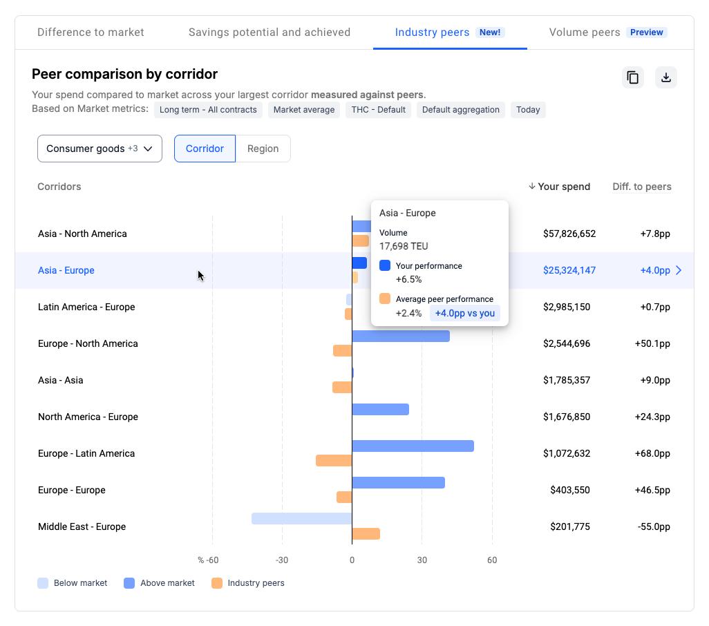
The chart found in the Industry peers tab provides an overview of how your performance compares to your peers across ten of your largest corridors or regions by spend:
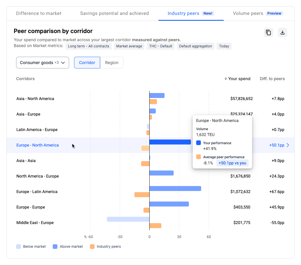
If you hover over an individual corridor, you can see more details — your volume on that corridor, your performance vs. the market, as well as the average peer performance and how much it differs from yours.
In the example shown above, your performance on Europe – North America is 41.9% above average market performance, while your peers are 8.1% below the market, meaning that their spend on that corridor is lower than yours by 50.1 percentage points.
Peer comparison shows you the current market data by default, but you can also use the Look back filter to review historical data up to four years in the past.
Compare to volume peers
To see how your performance compares to that of your peers who ship similar volumes on your largest corridors, go to the Volume peers tab:
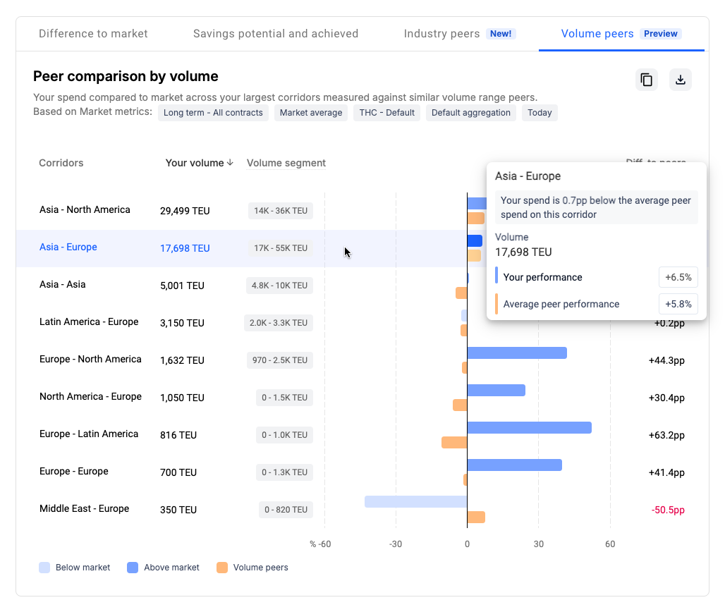
In the example shown above, your performance on the Asia to Europe corridor is 6.5% above market average, while the peers within your volume segment are on average 5.8% above the market, meaning that their spend on that corridor is still lower than yours by 0.7 percentage points.
Peer comparison methodology pre-requisites
Before we show it in the platform, the Peer comparison data must meet the following quality criteria:
- To anonymize the benchmark, the data on any given corridor for a given industry must come from at least four different companies that belong to that industry
- Companies are included in the calculations when at least 65% of their spend is covered by our market data
- Average peer performance is calculated using only the rates that are in our aggregation