Rate Adjustment Graph
Rate details
The Rate Adjustment Graph shows how your freight charges have changed over the course of a contract. While the summary tiles above provides today’s totals on a rate, the graph highlights how your origin, ocean, and destination charges have increased or decreased over time.
Rate components are grouped by segment (origin, ocean, destination) with each segment displayed in a different colour, making it easy to see how each contributes to the overall cost and where adjustments have occurred.
Hover on a specific period to see the category values. Click and drag to zoom in.
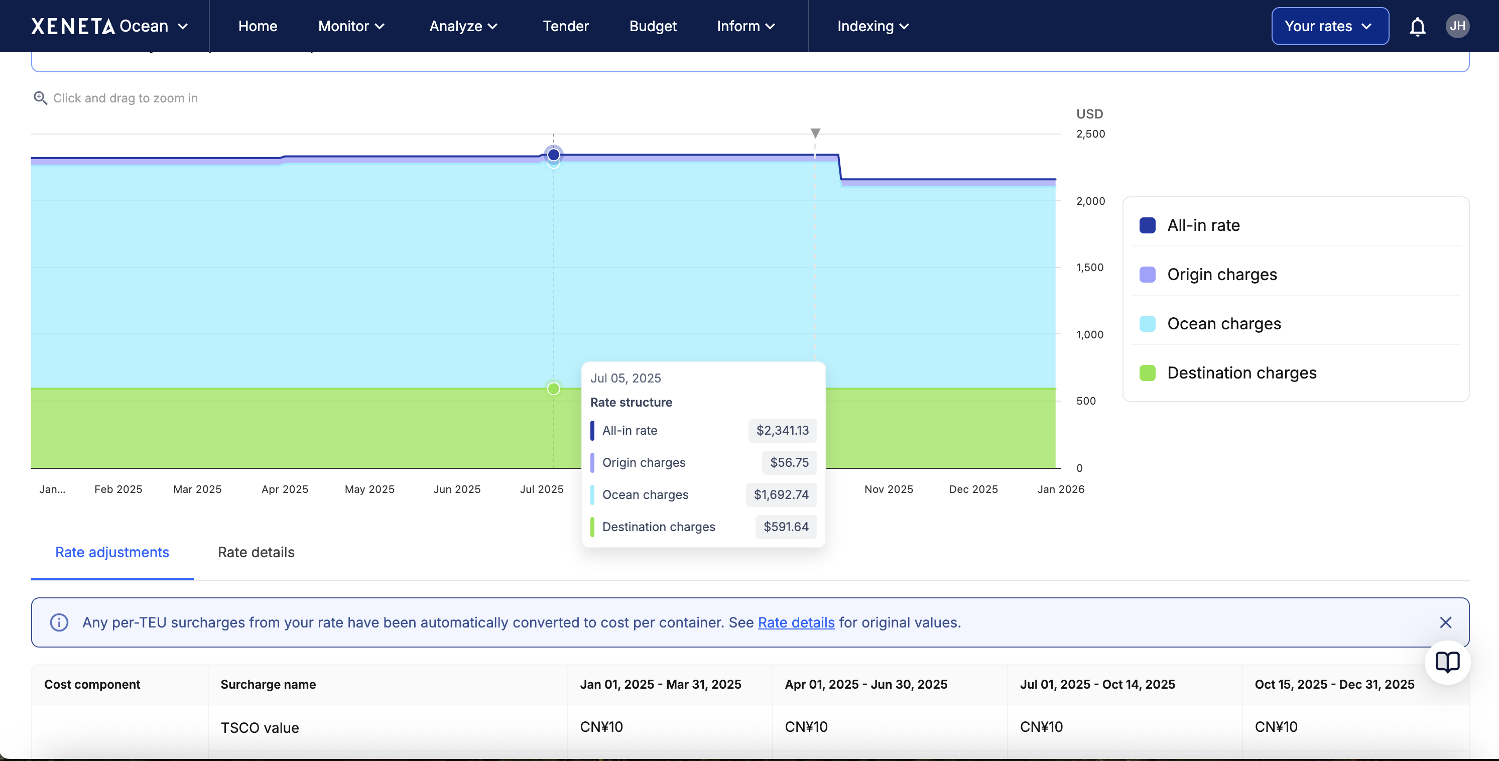
X-Axis (horizontal): timeline showing the contract period
Y-Axis (vertical): total charges in USD
The graph shows three stacked layers representing different charge categories: origin, ocean, and destination charges. Each layer's thickness represents the cost of that category. The total height at any points shows the complete all-in-rate.
Understanding currency conversion
The Rate Adjustment Graph automatically converts all total rows to USD for easy apples-to-apples comparison.
- Origin charges total - converted to USD
- Ocean charges total - converted to USD
- Destination charges total - converted to USD
- All-in-rate - sum of the 3 totals above, displayed in USD
If you would like to view the charges in their native currency, please scroll to the Rate Adjustment Table.
Exchange rates are automatically retrieved and applied every 24 hours.
- Current period columns update daily with the latest rates.
- Future period columns use the latest rates until that period becomes active.
- Historical period columns retain the exchange rate from the final day of that period.
- Expired contracts use the final exchange rate from their last active day.
In summary
Use the Rate Adjustments Graph to:
- Visualize how costs evolve during a contract without relying on complex spreadsheets
- Identify increases, decreases, or spikes in origin, ocean, or destination charges
- Quickly understand the drivers of rate changes to improve forecasting and contract planning
Updated 5 months ago