Market segments
Xeneta organizes its freight rate benchmark data into five groups to help you compare your rates against different segments of the ocean freight market.
Market segment | Description |
|---|---|
| Market high | The rate seen at the 97.5 percentile of the market. In other words, only 2.5% of the market rates will be above the rates seen here. |
| Market mid-high | The rate seen at the 75 percentile of the market. In other words, 25% of market rates will be above the rates seen here. |
| Market average | The arithmetic average rate seen on the market. |
| Market mid-low | The rate seen at the 25 percentile of the market. In other words, 75% of market rates will be above the rates seen here. |
| Market low | The rate seen at the 2.5 percentile of the market. In other words, 97.5% of market rates will be above the rates seen here. |
You can think of these groups as windows into different sections of the market for specific trade lanes or corridors.
How we create benchmarks
Xeneta creates a benchmark by first requesting a list of rates that are comparable to your rates from its database, and then aggregating that list of rates into a single number based on your selected market segment.
As an example, let's say you want to benchmark your rates for the Shanghai – Oslo trade lane on today's date. To provide you with a single figure, Xeneta needs to perform a number of calculations "behind the scenes".
Let's assume that the following ten rates are available to Xeneta for Shanghai – Oslo:
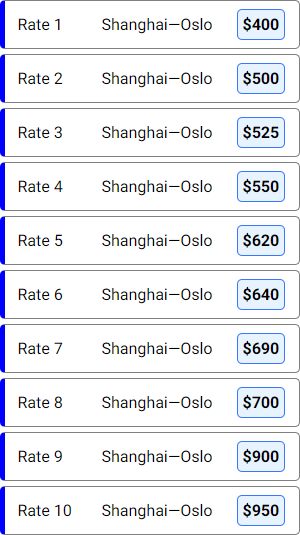
These ten rates represent the different rates that have been paid to ship cargo from Shanghai to Oslo. Any individual rate by itself will not say anything meaningful about the freight market as a whole. However, if we take all these rates together, we can calculate their average, as well as the lowest and highest rates for the trade lane.
The example described here is shown for illustration purposes only. It does not reflect real-world freight rates on the Shanghai – Oslo trade lane, nor does it use Xeneta's data quality considerations.
Market average
The market average rate is calculated by taking the arithmetic mean of all the rates available in our database.
Going back to our previous example, the arithmetic mean for these ten rates will be calculated as follows:

The resulting number will then be rounded up or down (in our case, to $648) and used as the Market average value, allowing you to compare your rate to the average rate seen on Shanghai – Oslo.
Keep in mind that since Market average is calculated as an actual arithmetic mean while other segments are based on percentiles, it's possible to see rare cases where, for example, Market average is higher than Mid-high.
Market low and high
We calculate the market low and market high segments by looking at the rates at the 2.5 and 97.5 percentiles of the trade lane data available to Xeneta. This is the same calculation that you can perform in Excel using the PERCENTILE.INC function.
Plotted on a line graph, the market low and market high values for our example rates will look like this:
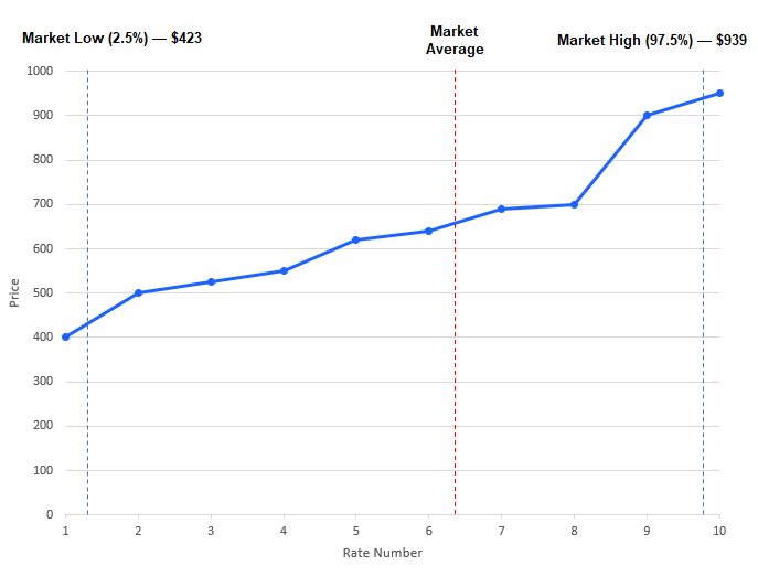
Since our example only has ten rates, the 2.5 percentile is located between rate 1 and rate 2, while the 97.5 percentile is located between rate 9 and 10.
To provide a value for benchmarking, Xeneta will take a linear interpolation between two rates to assign an appropriate value for the low and high market segments. This puts the market low value in our example at $423, while market high is at $939.
Market mid-low and mid-high
The market mid-low and market mid-high segments are calculated by looking at the values at the 25 and 75 percentiles of the trade lane rate data available to Xeneta.
Plotted on a line graph, the Market mid-low and Market mid-high for our example rates will look like this:
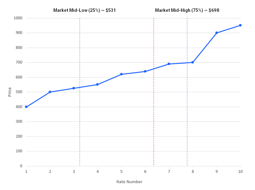
As we can see, the mid-low segment is located between rate 3 and rate 4, while the mid-high segment is located between rate 7 and 8, with the market mid-low and mid-high values sitting at $531 and $698 respectively.
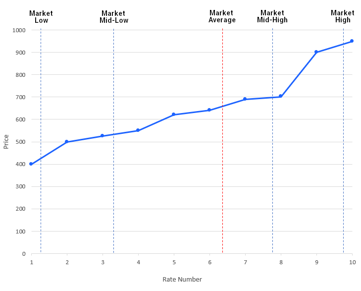
All market segments
Having calculated five different benchmarking positions for our rates on the Shanghai – Oslo trade lane, we can see their distribution on a single chart like this: