Market benchmarks | Air
Air Monitor
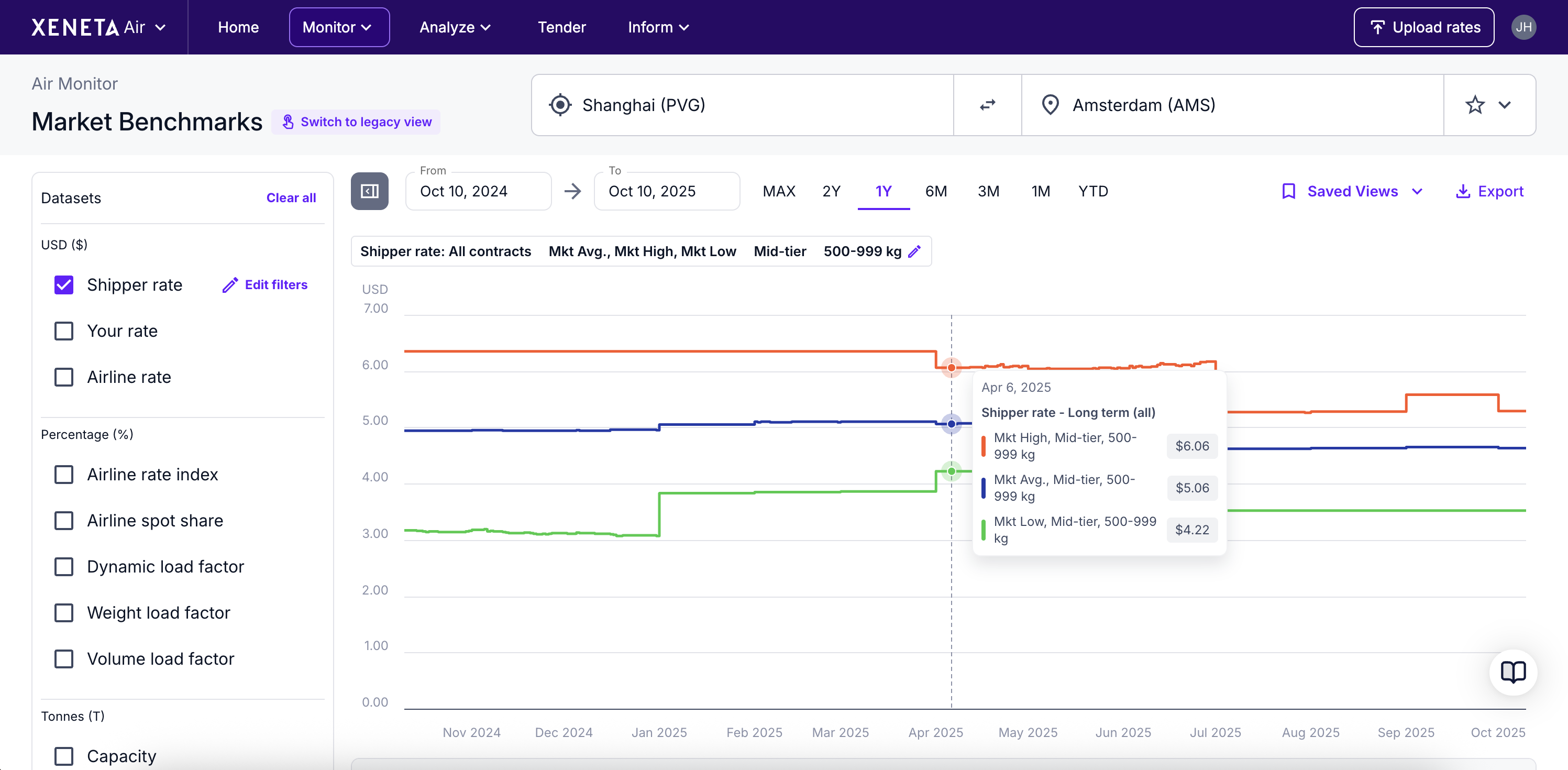
Market Benchmarks helps you compare the difference between the market dynamics and your own rates on a selected trade lane within a specific time period.
Adjust data
You have several filter options to help you adjust the data you see on the graph.
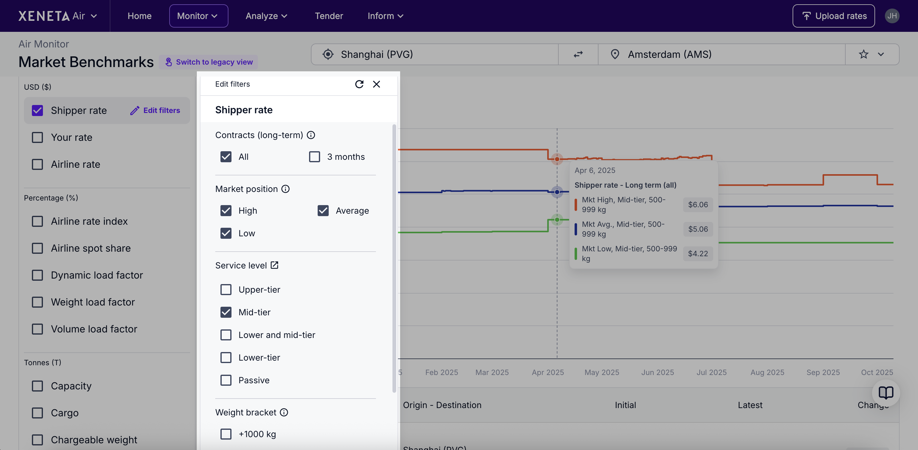
In addition to a date range and the origin-destination selector, you also have the option of adjusting further filters on different datasets, e.g. on Shipper rate, you have the options of:
- Weight category
- Service level
- Contracts
Dataset guide
Refer to the table below for guidance on using each dataset available in Market Benchmarks.
Dataset | Unit | Why use it |
|---|---|---|
Shipper rate | $ | These are the contracted rates that shippers (anonymised) are paying. Combine Shipper rate and Your rate datasets together to compare yourself to the market (position options: high, average, low). |
Your rate | $ | If you have uploaded your supplier rates to Xeneta, you can add them to the graph by checking on the Your rate dataset. This will allow you to compare the rates offered to you by your freight forwarding partners to the average air freight market rates and see if you could potentially renegotiate a better deal. |
Airline rate | $ | These are the rates that airlines charge freight forwarders for moving cargo. These prices exist as spot (short validity) or long-term rates, and they form the cost base that forwarders pass through to shippers. Compare spot vs long-term rates to optimize procurement mix or pair with Shipper rate to monitor general margin dynamics. |
Airline rate index | % | This index shows changes in overall airline selling rates, with a starting value of 100%. It reflects the average across all weights, contract lengths, and cargo types. It’s a weekly indicator of airline selling price levels on a lane, providing a quick read on the cost base that forwarders face. You can use Airline rate index as a directional indicator – for example, comparing it with Shipper rate to gauge where shipper pricing may move in the coming months. |
Airline spot share | % | This shows you the proportion of airline volume sold on an ad-hoc (spot) basis. Airline spot share indicates how much of forwarder’s purchases are on the airline spot market. Rising spot share signals forwards shifting more procurement to spot; falling spot share suggests locking into long-term contracts. Airline spot share can be used to read on forwarder behaviour and the likelihood of price volatility on that lane. |
Dynamic Load Factor (DLF) | % | Dynamic Load Factor (DLF) measures aircraft utilization by accounting for both constraints simultaneously: weight and volume. It reflects how “full” flights are once you consider whichever limit (weight or cube) binds first. DLF can be used as a negotiation signal. For example, when DLF is 80% or higher, it indicates that around 80% of total airfreight capacity is already being used. This suggests space is tight, demand for cargo capacity is high, and sellers have more pricing power. When DLF is below 80%, it means there’s more available capacity relative to demand, so airlines are more likely to compete to fill empty space. Shipper rate and DLF can be used together to anticipate potential price increases or reliability issues. For instance, when DLF rises above ~80%, it signals tight capacity and higher risk of delays; shippers should anticipate price increases and consider diversifying timing and lanes to mitigate risk. When DLF is decreasing, use that as leverage in negotiations for lower prices. Another option is to combine Airline spot share with DLF to anticipate potential price or reliability risks. When DLF is rising (tightening capacity) and spot share is high, airlines can adjust prices quickly – increasing the likelihood of rate hikes and reduced reliability. |
Weight Load Factor (WLF) | % | The share of available weight capacity that was filled, measured in tonnes. Weight load factor (WLF) can be used to see whether a lane is weight constrained. For example, if WLF is higher than VLF, it indicates that the aircraft is carrying dense cargo such as metals or machinery. |
Volume Load Factor (VLF) | % | The share of available volumetric capacity that was filled, measured in cubic meters. Volume load factor (VLF) can be used to see whether a lane is space constrained. For example, if VLF is higher than WLF, it indicates that the aircraft is carrying bulky, but not heavy cargo such as textiles. If VLF is 15+% higher than WLF, it indicated space-heavy cargo. In these cases, airlines may offer a density rebate – a lower rate per kilogram for denser shipments that better utilize weight capacity. |
Capacity | Tonnes | The total weight-carrying space airlines make available for cargo on a given route, expressed in metric tonnes. It reflects supply and is commonly paired with Cargo (tonnes) and Weight load factor (WLF) to access utilization and market tightness. |
Cargo | Tonnes | The total weight of freight flown on a route, expressed in metric tonnes. Trend Cargo (tonnes) vs _Capacity (tonnes) to see if demand is tightening or loosening; rising cargo with flat capacity typically lifts utilisation and price pressure, while falling cargo eases negotiations. |
Chargeable Weight (CHW) | Tonnes | Chargeable weight is the weight airlines and forwarders bill on – whichever is higher between the actual weight (tonnes) or the volumetric weight (cubic meters). It aligns pricing to the space or mass that constrains the aircraft. When the Chargeable weight is higher than the actual weight, it indicates the aircraft is limited by space rather than weight – typically because it’s carrying bulky, lightweight cargo such as textiles (volumetric drives cost). When the actual weight exceeds the volumetric weight, the aircraft is weight constrained, often due to dense cargo like metals or machinery (actual kg drives cost). |
Capacity | Cubic meters (m³) | Is the total volumetric capacity airlines offer for cargo on a given route, expressed in cubic meters. It reflects supply and is commonly paired with Cargo (m³) and Volume load factor (VLF) to access utilization and market tightness. |
Cargo | Cubic meters (m³) | The total volume of freight flown on a route, expressed in cubic meters. Trend Cargo (m³) vs Capacity (m³) to see if demand is tightening or loosening; rising cargo with flat capacity typically lifts utilisation and price pressure, while falling cargo eases negotiations. |
Please note capacity, cargo, and load factor datasets are based on direct flights.
While Chargeable Weight reflects the full shipment journey including stopover.
Updated 6 days ago